CSS3新增知识

CSS3新增知识

1.1、CSS3的概念和优势

  1. CSS3是css技术的升级版本, CSS3语言开发是朝着模块化发展的。以前的规范作为一个模块实在是太庞大而且比较复杂,所以,把它分解为-些小的模块,更多新的模块也被加入进来。这些模块包括:盒子模型、列表模块、超链接方式、语言模块、背景和边框、文字特效、多栏布局等。
  2. css3的优点: CSS3将完全向后兼容,所以没有必要修改现在的设计来让它们继续运作。网络浏览器也还将继续支持CSS2.对我们来说,CSS3主要的影响是将可以使用新的可用的选择器和属性,这些会允许实现新的设计效果(譬如动态和渐变) ,而且可以很简单的设计出现在的设计效果(比如说使用分栏)

1.2、渐进增强和优雅降级

  1. 渐进增强progressive enhancement:
    针对低版本浏览器进行构建页面,保证最基本的功能,然后再针对高级浏览器进行效果、交互等改进和追加功能达到更好的用户体验。
  2. 优雅降级graceful degradation: .
    一开始就构建完整的功能, 然后再针对低版本浏览器进行兼容.
  3. 区别:
    优雅降级是从复杂的现状开始,并试图减少用户体验的供给,而渐进增强则是从-个非常基础的,能够起作用的版本开始,并不断打充,以适应未来环境的需要。降级(功能衰减)意味着往回看;而渐进增强则意味着朝前看,同时保证其根基处于安全地带。

一、选择器

1.3、层级选择器( > + ~) [重点掌握]

  • E**>**F子选择器选择匹配的F元素,匹配的F元素所匹配的E元素的子元素 (子代选择器,区别于空格的后代选择器)
  • E**+** F相邻兄弟选择器选择匹配的F元素,且匹配的F元素紧位于匹配的元素的后面 (兄弟选择器)
  • E~F通用选择器选择匹配的F元素,且位于匹配的E元素后的所有匹配的F元素
1
2
3
4
5
6
7
8
9
10
11
12
13
14
15
16
17
18
19
20
21
22
23
24
25
26
27
28
29
30
31
32
33
34
35
36
37
38
39
40
41
42
43
44
45
46
47
48
49
50
<!DOCTYPE html>
<html lang="en">
<head>
<meta charset="UTF-8">
<meta name="viewport" content="width=device-width, initial-scale=1.0">
<title>Document</title>

<style>
/* 子代选择器 */
.box>li {
border:1px solid red;
}
/* + 当前元素的后面第一个兄弟 */
/* .child+li{
background:yellow;
} */

/* ~ 当前元素的后面所有的亲兄弟 */
.child~li{
background:yellow;
}

.container~p{
background:red;
}
</style>
</head>
<body>
<ul class="box">
<li>1111
<ul>
<li>111-111</li>
<li>111-222</li>
<li>111-333</li>
</ul>
</li>
<li class="child">2222</li>
<li>3333</li>
<li>44444</li>
<li>5555</li>
</ul>

<div class="container">div-111111</div>
<p>p-1111</p>
<p>p-2222</p>
<div>
<p>p-3333333</p>
</div>
</body>
</html>

1.4、属性选择器 ( [属性名]) [重点掌握]

  1. E[attr]: 只使用属性名,但没有确定任何属性值;

  2. E[attr= “value”]:指定属性名,并指定了该属性的属性值;

  3. E[attr= “value”]:指定属性名,并且具有属性值,此属性值是一个词列表, 并且以空格隔开,其中词列表中包含了一个value词,而且等号前面的“”不能不写.

    扩展知识(了解)

  4. E[attr^= “value”]:指定了属性名,并且有属性值,属性值是以value开头的;

  5. E[attr$=”value”]: 指定了属性名,并且有属性值,且属性值是以value结束的

  6. Eattr*= “value”]:指定了属性名,并且有属性值,而且属值中包含了value;

1
2
3
4
5
6
7
8
9
10
11
12
13
14
15
16
17
18
19
20
21
22
23
24
25
26
27
28
29
30
31
32
33
34
35
36
37
38
39
40
41
42
43
44
45
46
47
48
49
50
51
52
53
54
55
56
57
58
59
60
61
62
63
64
65
66
67
68
69
<!DOCTYPE html>
<html lang="en">
<head>
<meta charset="UTF-8">
<meta name="viewport" content="width=device-width, initial-scale=1.0">
<title>Document</title>
<style>
/* 属性选择器 [class,,] */

div[class]{
background:yellow;
}
p[class]{
background:red;
}

/* div .box1 {

} */
/* 完全匹配 */
/* div[class=box1]{
border:1px solid blue;
} */

/* 包含就匹配 */
div[class~=box1]{
border:1px solid blue;
}


input[name]{
background:yellow;
}

input[type=email]{
background:red;
}


/* 模糊匹配
class^=b 以这个开头的
class$=b 以这个结尾
class*=b 包含某个字符 */

div[class*="1"],p[class*="1"]{
color:green;
}
</style>
</head>
<body>
<div class="box1">div-11111</div>
<div class="box2">div-22222</div>
<div >div-33333</div>
<div class="box1">div-44444</div>
<div class="box1 box3">div-555555555555555</div>
<p class="p1">p-11111</p>
<p class="p2">p-22222</p>
<p >p-33333</p>


<div>
<h1>注册页面</h1>
用户名:<input type="text" name="username"> <br>
密码:<input type="password" name="password"><br>
年龄<input type="number" name="age"><br>
邮箱<input type="email"><br>
</div>
</body>
</html>

1.5、伪类选择器 ( : 表示) [重点掌握]

1.5.1、结构伪类选择器

  1. X:first- child匹配子集的第一个元素。IE7就可以支持

  2. X:last- child匹配父元素中最后一个X元素

1
2
3
4
5
6
7
8
9
10
11
12
13
14
15
16
17
18
19
20
21
22
23
24
25
26
27
28
29
30
31
32
33
34
35
36
37
38
39
40
<!DOCTYPE html>
<html lang="en">
<head>
<meta charset="UTF-8">
<meta name="viewport" content="width=device-width, initial-scale=1.0">
<title>Document</title>
<style>
.box{
width: 940px;
height: 100px;
margin:0 auto;
background:yellow;
}

.box div{
float:left;
width: 300px;
height: 100px;
background: red;
margin-right: 20px;
}

.box div:last-child{
margin-right: 0;
}
</style>
</head>
<body>
<!-- 通过某种结构关系查找页面元素.
比如:
匹配某元素第一个子元素
匹配某元素最后一个子元素 -->

<div class="box">
<div></div>
<div></div>
<div></div>
</div>
</body>
</html>
  1. X:nth-child(n)用于匹配索引值为n的子元素。索引值从1开始

    1
    2
    3
    4
    5
    6
    7
    8
    9
    10
    11
    12
    13
    14
    15
    16
    17
    18
    19
    20
    21
    22
    23
    24
    25
    26
    27
    28
    29
    30
    31
    32
    33
    34
    35
    36
    37
    <!DOCTYPE html>
    <html lang="en">
    <head>
    <meta charset="UTF-8">
    <meta name="viewport" content="width=device-width, initial-scale=1.0">
    <title>Document</title>

    <style>
    /* ul li:first-child{
    background:yellow;
    }
    ul li:last-child{
    background:red;
    } */


    /* 第几个 */
    /* li:nth-child(2){
    background:blue;
    } */

    /* 第几个, 偶数2n(even) 奇数 2n+1 2n-1(odd) */
    li:nth-child(odd){
    background:yellow;
    }
    </style>
    </head>
    <body>
    <ul>
    <li>11111</li>
    <li>22222</li>
    <li>33333</li>
    <li>44444</li>
    <li>55555</li>
    </ul>
    </body>
    </html>
  2. X:only- child这个伪类一般用的比较少, 比如上述代码匹配的是div下的有且仅有-个的p,也就是说,如果div内有多个p,将不匹配。

    1
    2
    3
    4
    5
    6
    7
    8
    9
    10
    11
    12
    13
    14
    15
    16
    17
    18
    19
    20
    21
    22
    23
    24
    25
    26
    27
    28
    29
    30
    31
    32
    33
    <!DOCTYPE html>
    <html lang="en">
    <head>
    <meta charset="UTF-8">
    <meta name="viewport" content="width=device-width, initial-scale=1.0">
    <title>Document</title>
    <style>
    div{
    border:1px solid black;
    }

    div p:only-child {
    background:red;
    }
    </style>
    </head>
    <body>
    <div>
    <p>1111</p>
    <p>2222</p>
    </div>

    <div>
    <p>1111</p>
    <p>2222</p>
    <p>3333</p>
    </div>

    <div>
    <p>11111</p>
    </div>
    </body>
    </html>
  3. X:root匹配文档的根元素。在HTML (标准通用标记语言下的一个应用)中,根元素永远是HTML

    1
    2
    3
    4
    5
    6
    7
    8
    9
    10
    11
    12
    13
    14
    15
    16
    17
    18
    19
    20
    21
    22
    23
    24
    25
    <!DOCTYPE html>
    <html lang="en">
    <head>
    <meta charset="UTF-8">
    <meta http-equiv="X-UA-Compatible" content="IE=edge">
    <meta name="viewport" content="width=device-width, initial-scale=1.0">
    <title>Document</title>
    <style>
    /* html,body{
    height: 100%;
    width: 100%;
    background: red;
    } */
    /* 以下代码可以实现相同效果 */
    :root,body{
    width: 100%;
    height: 100%;
    background: green;
    }
    </style>
    </head>
    <body>

    </body>
    </html>
  4. X:empty匹配没有任何子元素(包括包含文本)的元素X

    1
    2
    3
    4
    5
    6
    7
    8
    9
    10
    11
    12
    13
    14
    15
    16
    17
    18
    19
    20
    21
    22
    23
    24
    25
    <!DOCTYPE html>
    <html lang="en">
    <head>
    <meta charset="UTF-8">
    <meta http-equiv="X-UA-Compatible" content="IE=edge">
    <meta name="viewport" content="width=device-width, initial-scale=1.0">
    <title>Document</title>
    <style>
    div{
    height: 100px;
    width: 100px;
    }
    div:empty{
    background: darksalmon;
    }
    </style>
    </head>
    <body>
    <!-- 注意:空格,换行等不等于空 -->
    <div>

    </div>
    <div></div>
    </body>
    </html>
结构伪类汇总:
  1. X:first- child匹配子集的第一个元素。IE7就可以支持

  2. X:last- child匹配父元素中最后-个X元素

  3. X:nth-child(n)用于匹配索引值为n的子元素。索引值从1开始

  4. X:root匹配文档的根元素。在HTML (标准通用标记语言下的一个应用)中,根元素永远是HTML

1.5.2、目标伪类选择器

  1. ==E:target==选择匹配E的所有元素,且匹配元素被相关URL指向

    1. 锚点案例:

      1
      2
      3
      4
      5
      6
      7
      8
      9
      10
      11
      12
      13
      14
      15
      16
      17
      18
      19
      20
      21
      22
      23
      24
      25
      26
      27
      28
      29
      30
      31
      32
      33
      34
      35
      36
      37
      38
      39
      40
      41
      42
      43
      44
      45
      46
      47
      48
      49
      50
      51
      52
      53
      54
      55
      56
      57
      58
      59
      60
      61
      62
      63
      64
      65
      66
      67
      68
      69
      70
      71
      72
      73
      74
      75
      76
      <!DOCTYPE html>
      <html lang="en">
      <head>
      <meta charset="UTF-8">
      <meta name="viewport" content="width=device-width, initial-scale=1.0">
      <title>Document</title>
      <style>
      *{
      margin:0;
      padding:0
      }
      ul{
      list-style: none;
      position: fixed;
      right: 0px;
      top:100px;
      }
      li{
      width: 100px;
      height: 50px;
      line-height: 50px;
      text-align: center;
      border:1px solid black;

      }

      div{
      height: 600px;
      border:1px solid #ccc;
      /* background:yellow; */
      }

      div:target{
      background: yellow;
      }


      /* 锚点作用:页面不同区域的跳转, 使用a链接。
      <a href="#锚点名字"></a>

      <div id="锚点名字"></div>

      */
      </style>
      </head>
      <body>
      <ul>
      <li>
      <a href="#a">京东秒杀</a>
      </li>
      <li>
      <a href="#b">双11</a>
      </li>
      <li>
      <a href="#c">频道优选</a>
      </li>
      <li>
      <a href="#d">特色广场</a>
      </li>
      </ul>

      <div id="a">
      京东秒杀
      </div>
      <div id="b">
      双11
      </div>
      <div id="c">
      频道优选
      </div>
      <div id="d">
      特色广场
      </div>

      </body>
      </html>
    2. 手风琴案例:

      1
      2
      3
      4
      5
      6
      7
      8
      9
      10
      11
      12
      13
      14
      15
      16
      17
      18
      19
      20
      21
      22
      23
      24
      25
      26
      27
      28
      29
      30
      31
      32
      33
      34
      35
      36
      37
      38
      <!DOCTYPE html>
      <html lang="en">
      <head>
      <meta charset="UTF-8">
      <meta name="viewport" content="width=device-width, initial-scale=1.0">
      <title>Document</title>
      <style>
      div.content{
      /* 两者区别:display:block会从文档流消失,而visibility: hidden ,相当于彻底透明,但是本身还在文档流用占用空间*/
      /* display: none; */
      display: none;
      }
      div.content:target{
      display: block;
      }
      </style>
      </head>
      <body>
      <div>
      <a href="#aaa">aaa</a>
      <div id="aaa" class="content">
      Lorem ipsum dolor sit amet consectetur adipisicing elit. Fuga odio eos natus cupiditate distinctio sequi, dolorum, obcaecati vel facilis velit provident deleniti inventore tempora iste, aut optio magnam asperiores non?
      </div>
      </div>
      <div>
      <a href="#bbb">bbb</a>
      <div id="bbb" class="content">
      Lorem ipsum dolor sit amet consectetur adipisicing elit. Fuga odio eos natus cupiditate distinctio sequi, dolorum, obcaecati vel facilis velit provident deleniti inventore tempora iste, aut optio magnam asperiores non?
      </div>
      </div>
      <div>
      <a href="#ccc">ccc</a>
      <div id="ccc" class="content">
      Lorem ipsum dolor sit amet consectetur adipisicing elit. Fuga odio eos natus cupiditate distinctio sequi, dolorum, obcaecati vel facilis velit provident deleniti inventore tempora iste, aut optio magnam asperiores non?
      </div>
      </div>
      </body>
      </html>

1.5.3、UI元素状态伪类选择器

  1. E:==enabled==匹配所有用户界面(form表单)中处于==可用状态==的E元素
  2. E:==disabled==匹配所有用户界面(form表单) 中处于==不可用状态==的E元素
  3. E:==checked==匹配所有用户界面(form表单) 中处于==选中状态==的元素E
  4. E==::====selection==匹配E元素中被用户==选中或处于高亮状态==的部分
  5. E:==focus== 匹配E元素==获得焦点==的时候
1
2
3
4
5
6
7
8
9
10
11
12
13
14
15
16
17
18
19
20
21
22
23
24
25
26
27
28
29
30
31
32
33
34
35
36
37
38
39
40
41
42
43
44
45
46
47
48
49
50
51
52
53
54
55
<!DOCTYPE html>
<html lang="en">
<head>
<meta charset="UTF-8">
<meta name="viewport" content="width=device-width, initial-scale=1.0">
<title>Document</title>
<style>
input:enabled{
background: red;
}

input:disabled{
background:yellow;
}

/* 焦点 会匹配此选择器 */
input:focus{
/* background: blue; */
}

input[type=checkbox]{
/* 去掉默认样式 */
appearance: none;
width: 20px;
height: 20px;
border:1px solid black;
}
input:checked{
/* 去除默认样式后不再生效 */
background:red;
}

div::selection{
background:yellow;
color:red;
}
</style>
</head>
<body>

<form action="">
用户名<input type="text"> <br>
密码<input type="password"> <br>

记住用户名 <input type="checkbox"> <br>

<input type="submit" disabled>
</form>


<div>
Lorem ipsum dolor sit amet consectetur adipisicing elit. Aliquid perferendis adipisci nihil repudiandae, maiores vero et, inventore facilis dolor eius consequatur nemo eaque. Dolorem, corrupti? Dolore molestiae dolorem esse laborum!
</div>
</body>
</html>

1.5.4、否定伪类选择器

  1. E:not(s) (IE6-8浏览器不支持:not(选择器。 )
    匹配所有不匹配简单选择符s的元素E
1
2
3
4
5
6
7
8
9
10
11
12
13
14
15
16
17
18
19
20
21
22
23
24
25
26
27
28
29
30
31
32
33
34
35
36
37
38
39
40
41
42
43
44
45
46
47
48
<!DOCTYPE html>
<html lang="en">
<head>
<meta charset="UTF-8">
<meta http-equiv="X-UA-Compatible" content="IE=edge">
<meta name="viewport" content="width=device-width, initial-scale=1.0">
<title>Document</title>
<style>
ul{
list-style: none;
}
li:not(:first-child){
background: yellow;
}
li:not(:nth-child(even)){
color: red;
}
div{
height: 100px;
width: 100px;
border: 1px solid greenyellow;
}
div:not(:empty){
background: hotpink;
}
input:active{
background: red;
}
a:hover{
background: seagreen;
}
</style>
</head>
<body>
<ul>
<li>1111</li>
<li>2222</li>
<li>3333</li>
<li>4444</li>
</ul>
<div></div>
<div>1111</div>

<input type="button" value="按钮">
<br>
<a href="">sssss</a>
</body>
</html>

1.5.5、动态伪类选择器

  1. ==E:link==
    链接伪类选择器
    ==选择匹配的E玩素,而且匹配元素被定义了超链接==并未被访问过。常用于链接描点上
  2. ==E:visited==
    链接伪类选择器
    选择匹配的E元素,而且匹配元素被定义了超链接并==已被访问过。==常用于链接描点上
  3. ==E:active==
    用户行为选择器
    选择匹配的E玩素,且==匹配元素被激活(如链接被点击时)==。常用于链接描点和按钮上
  4. ==E:hover==
    用户行为选择器
    选择匹配的E元素,且==用户鼠标停留在元素E上==。IE6及以下浏览器仅支持a:hover
1
2
3
4
5
6
7
8
9
10
11
12
13
14
15
16
17
18
19
20
21
22
23
24
25
26
27
28
29
30
31
32
33
34
35
36
37
38
39
40
41
42
43
44
45
46
47
48
<!DOCTYPE html>
<html lang="en">
<head>
<meta charset="UTF-8">
<meta http-equiv="X-UA-Compatible" content="IE=edge">
<meta name="viewport" content="width=device-width, initial-scale=1.0">
<title>Document</title>
<style>
ul{
list-style: none;
}
li:not(:first-child){
background: yellow;
}
li:not(:nth-child(even)){
color: red;
}
div{
height: 100px;
width: 100px;
border: 1px solid greenyellow;
}
div:not(:empty){
background: hotpink;
}
input:active{
background: red;
}
a:hover{
background: seagreen;
}
</style>
</head>
<body>
<ul>
<li>1111</li>
<li>2222</li>
<li>3333</li>
<li>4444</li>
</ul>
<div></div>
<div>1111</div>

<input type="button" value="按钮">
<br>
<a href="">sssss</a>
</body>
</html>

二、阴影

2.1、文本阴影

  • text-shadow:水平偏移位置 垂直偏移位置 阴影模糊距离 阴影颜色 ;

    image-20230214182209115

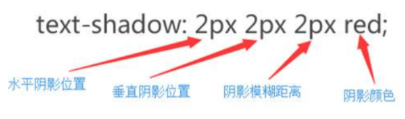
  • 注意:==水平、垂直阴影的位置允许负值,并可进行多阴影设置(中间逗号隔开)==

1
2
3
4
5
6
7
8
9
10
11
12
13
14
15
16
17
18
19
20
21
22
23
24
25
26
<!DOCTYPE html>
<html lang="en">
<head>
<meta charset="UTF-8">
<meta name="viewport" content="width=device-width, initial-scale=1.0">
<title>Document</title>
<style>
div{
text-shadow: 0px -10px 1px red, 0px 10px 1px yellow;
/* text-shadow: 0px 10px 1px yellow; */
}

/*
10px 水平方向位移
10px 垂直方向的位移

1px 模糊程度

red 阴影颜色
*/
</style>
</head>
<body>
<div>大家好</div>
</body>
</html>

2.2、盒子阴影

  • box-shadow

    • 属性值:

      1639638610018

1
2
3
4
5
6
7
8
9
10
11
12
13
14
15
16
17
18
19
20
21
22
23
24
<!DOCTYPE html>
<html lang="en">
<head>
<meta charset="UTF-8">
<meta name="viewport" content="width=device-width, initial-scale=1.0">
<title>Document</title>
<style>
div{
width: 100px;
height: 100px;
background:yellow;
margin:0 auto;
/* box-shadow: -10px -10px 10px 10px red,10px 10px 10px blue; */
box-shadow: 10px 10px 10px blue inset;
/* inset内阴影 */
}
</style>
</head>
<body>
<div>

</div>
</body>
</html>

三、圆角

3.1、圆角边框

1
2
3
4
5
6
7
8
9
10
11
12
13
14
15
16
17
18
19
20
21
22
23
24
25
26
27
28
29
30
31
32
33
<!DOCTYPE html>
<html lang="en">
<head>
<meta charset="UTF-8">
<meta name="viewport" content="width=device-width, initial-scale=1.0">
<title>Document</title>
<style>
div{
width: 200px;
height: 200px;
background:green;
margin:0 auto;
/* border-radius: 10px 50px 70px 100px; */

/* px 或者 百分比
v1 , 四个角一样
v1,v2, 左上右下, 左下右上 一致
v1,v2,v3 左上, 左下右上 右下

v1,v2,v3,v4 顺时针
*/

border-top-left-radius:10px;
border-top-right-radius:30px;
border-bottom-left-radius:60px;
border-bottom-right-radius:100px;
}
</style>
</head>
<body>
<div></div>
</body>
</html>

3.2、圆形案例

1
2
3
4
5
6
7
8
9
10
11
12
13
14
15
16
17
18
19
20
21
22
23
24
25
26
27
28
29
30
31
32
33
34
35
36
<!DOCTYPE html>
<html lang="en">
<head>
<meta charset="UTF-8">
<meta name="viewport" content="width=device-width, initial-scale=1.0">
<title>Document</title>
<style>
div{
width: 200px;
height: 200px;
background:green;
margin:0 auto;
padding:20px;
border:20px solid red;
/* border-radius: 30px/60px; */

/* 30px/60px 水平/垂直 支持border-radius*/

/* border-top-left-radius: 30px/60px; 不支持的*/


/* border-radius: 10px 20px 30px 40px/50px 60px 70px 80px; */


border-radius: 50%;

/* 一半===盒子的一半 50%*/
}
</style>
</head>
<body>
<div></div>


</body>
</html>

3.3、长方形案例

1
2
3
4
5
6
7
8
9
10
11
12
13
14
15
16
17
18
19
20
21
22
23
24
<!DOCTYPE html>
<html lang="en">
<head>
<meta charset="UTF-8">
<meta name="viewport" content="width=device-width, initial-scale=1.0">
<title>Document</title>
<style>
div{
width: 500px;
height: 200px;
background:green;
margin:0 auto;
/* border-radius: 10%; */
border-radius: 30px;
}
</style>
</head>
<body>

<div>

</div>
</body>
</html>

3.4、半圆案例

1
2
3
4
5
6
7
8
9
10
11
12
13
14
15
16
17
18
19
20
<!DOCTYPE html>
<html lang="en">
<head>
<meta charset="UTF-8">
<meta name="viewport" content="width=device-width, initial-scale=1.0">
<title>Document</title>
<style>
div{
width: 100px;
height: 50px;
background:green;
margin:0 auto;
border-radius: 50px 50px 0 0;
}
</style>
</head>
<body>
<div></div>
</body>
</html>

3.5、扇形案例

1
2
3
4
5
6
7
8
9
10
11
12
13
14
15
16
17
18
19
20
<!DOCTYPE html>
<html lang="en">
<head>
<meta charset="UTF-8">
<meta name="viewport" content="width=device-width, initial-scale=1.0">
<title>Document</title>
<style>
div{
width: 200px;
height: 200px;
background: green;
margin:0 auto;
border-radius: 0 0 0 200px;
}
</style>
</head>
<body>
<div></div>
</body>
</html>

3.6、圆角和阴影综合案例

1
2
3
4
5
6
7
8
9
10
11
12
13
14
15
16
17
18
19
20
21
22
23
24
25
26
27
28
29
30
31
32
33
34
35
36
37
38
39
40
41
42
43
44
45
46
47
48
49
50
51
52
53
54
55
56
57
58
59
60
<!DOCTYPE html>
<html lang="en">
<head>
<meta charset="UTF-8">
<meta http-equiv="X-UA-Compatible" content="IE=edge">
<meta name="viewport" content="width=device-width, initial-scale=1.0">
<title>圆角案例</title>
<style>
*{
padding: 0px;
margin: 0px;
}
input{
outline: none;
box-shadow: ;
}
div{
height: 120px;
line-height: 120px;
width: 936px;
text-align: center;
margin: 20px auto;
background: #f5f5f5;
border: 1px solid #dedede;
border-radius: 15px;
box-shadow: 4px 11px 7px #c0c0c0, -4px 11px 7px #c0c0c0;
/* position: relative; */
}
[type=text]{
height: 86px;
width: 683px;
margin: 0px auto;
border: 3px solid #cccccc;
border-radius: 3px;
/* 缩进 */
text-indent: 11px;
font-size: 24px;
color: #a9a9aa;
}
[type=submit]{
width: 200px;
height: 88px;
font-size: 22px;
color: #fff;
border-radius: 3px;
background: url("img/btn.png")repeat;
margin-left: 18px;
/* position: relative;
top: 1px; */
border: 1px solid #00748e;
}
</style>
</head>
<body>
<div>
<input type="text" placeholder="Serach for CSS3,HTML5,jQuery...">
<input type="submit" value="GO">
</div>
</body>
</html>

四、字体引入

4.1、@font- face

  • @font- face是CSS3中的一个模块,他主要是把自己2定义的Web字体嵌入到你的网页中,随着@font-face模块的出现,我们在Web的开发中使用字体不怕只能使用Web安全字体(@font face这个功能早在IE4就支持)

  • @font-face的语法规则:

    1
    2
    3
    4
    5
    6
    @font-face {
    font- family: YourWebFontName; .
    src: 相对路径/绝对路径;
    font-weight: 字体大小 ;
    font-style: 字体;
    }
  • @font- face语法说明:
    1、YourWebFontName:此值指的就是你自定义的字体名称,最好是使用你下载的默认字体,他将被引用到你的Web元素中的font-family。如”font-family:”YourWebFontName’”;”
    2、source:此值指的是你自定义的字体的存放路径,可以是相对路径也可以是绝路径;

1
2
3
4
5
6
7
8
9
10
11
12
13
14
15
16
17
18
19
20
21
22
23
<!DOCTYPE html>
<html lang="en">
<head>
<meta charset="UTF-8">
<meta name="viewport" content="width=device-width, initial-scale=1.0">
<title>Document</title>
<style>
@font-face{
font-family: kerwin;
src:url(font/ygyxsziti2.0.ttf);
}
div{
font-family: kerwin;
font-size: 50px;
color:red;
text-shadow: 5px 0px 0px green;
}
</style>
</head>
<body>
<div>赵钱孙李</div>
</body>
</html>

五、怪异盒模型

5.1、标准盒模型(内边距会撑大盒子模型)

  • 含义:更改原有布局盒子模型的计算方式通过box-sizing属性的取值进行更改

  • 属性: box-sizing:
    ==box-sizing属性允许您以特定的方式定义匹配某个区域的特定元素。==

  • 属性值: content-box
    这是由CSS2.1规定的宽度高度行为。宽度和高度分别应用到元素的内容框。在宽度和高度之外绘制元素的内边距和边框。

    image-20230214182300174

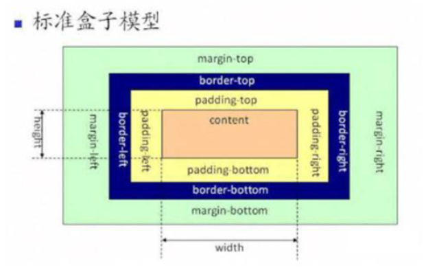
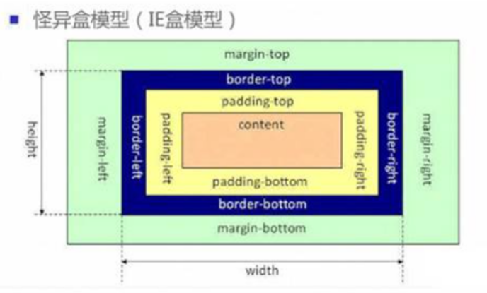
5.2、怪异盒模型(盒子大小固定,内边距和边框不会撑大)

  • 设置 box-sizing: border-box

  • 为元素设定的宽度和高度决定了元素的边框盒。

  • 就是说,为元素指定的任何内边距和边框都将在已设定的宽度和高度内进行绘制。通过从已设定的宽度和高度分别减去边框和内边距才能得到内容的宽度和高度。

    image-20230214182347040

5.3、案例

1
2
3
4
5
6
7
8
9
10
11
12
13
14
15
16
17
18
19
20
21
22
23
24
25
26
27
28
29
30
31
32
33
34
<!DOCTYPE html>
<html lang="en">
<head>
<meta charset="UTF-8">
<meta name="viewport" content="width=device-width, initial-scale=1.0">
<title>Document</title>
<style>
.box1{
width: 200px;
height: 200px;
background:green;
padding: 30px;
border:10px solid black;

box-sizing: content-box;
/* 标准盒模型 */
}
.box2{
width: 200px;
height: 200px;
background:red;
margin-top:100px;
padding: 30px;
border:10px solid black;
box-sizing: border-box;
/* 怪异盒模型 */
}
</style>
</head>
<body>
<div class="box1"></div>
<div class="box2"></div>
</body>
</html>

5.4、使用场景

1
2
3
4
5
6
7
8
9
10
11
12
13
14
15
16
17
18
19
20
21
22
23
24
25
26
27
28
29
30
31
32
33
34
35
<!DOCTYPE html>
<html lang="en">
<head>
<meta charset="UTF-8">
<meta name="viewport" content="width=device-width, initial-scale=1.0">
<title>Document</title>
<style>
.box{
width: 900px;
height: 300px;
background:yellow;
margin:0 auto;
}

.box div{
width: 300px;
height: 300px;
float: left;
text-align: center;
padding: 10px;
border:10px solid red;
box-sizing: border-box;
}
</style>
</head>
<body>
<div class="box">
<div>
Lorem ipsum dolor sit amet consectetur adipisicing elit. Eligendi voluptate nam obcaecati sequi blanditiis illum! Animi illo omnis ullam exercitationem quibusdam, suscipit, labore molestiae impedit corporis iste facere? Vitae, vero.
</div>
<div>Lorem ipsum, dolor sit amet consectetur adipisicing elit. Repudiandae totam voluptatem distinctio in omnis sequi ut voluptatum, fuga nulla. Qui cumque voluptatum consequatur libero? Eos omnis illum harum corporis facilis?</div>
<div>Lorem ipsum dolor sit amet consectetur adipisicing elit. Nostrum nam facere dicta praesentium animi perferendis harum neque similique rem laboriosam et magni, numquam tenetur veniam voluptatem. Nostrum esse pariatur dolorum.</div>
</div>
</body>
</html>

六、弹性盒

6.1、基本概念

  • 弹性盒是CSS3中新增的一种布局方式:特别适合移动端布局
  • 将一个盒子display属性设置为:flex,则表示为弹性盒
  • 弹性盒对子元素产生的影响:
    1. 使子元素默认横向排列
    2. 行内元素变成行内块元素 (inline-block)
    3. 只有一个元素的时候,margin:auto–将自动水平垂直方向居中
1
2
3
4
5
6
7
8
9
10
11
12
13
14
15
16
17
18
19
20
21
22
23
24
25
26
27
28
29
30
31
32
33
34
35
36
37
38
39
40
41
42
43
44
45
46
47
48
49
50
51
<!DOCTYPE html>
<html lang="en">
<head>
<meta charset="UTF-8">
<meta http-equiv="X-UA-Compatible" content="IE=edge">
<meta name="viewport" content="width=device-width, initial-scale=1.0">
<title>Document</title>
<style>
.box{
height: 400px;
width: 400px;
margin: 200px auto;
border: 2px solid black;
display: flex;

}
/* .box div{
width: 50px;
height: 50px;
border: 1px dotted red;

} */
.box span{
width: 50px;
height: 50px;
border: 1px dotted red;
/* 设置弹性盒子元素居中 */
margin: auto;
}
</style>
</head>
<body>
<!-- 弹性盒是CSS3中新增的一种布局方式:特别适合移动端布局 -->
<!--将父级盒子display属性设置为:flex则表示为弹性盒
弹性盒对子元素产生的影响
1.使子元素默认横向排列
2.行内元素变成块级元素
3.只有一个元素的时候,margin:auto--将自动水平垂直方向居中
-->
<div class="box">
<!-- <div>1111</div>
<div>2222</div>
<div>3333</div>
<div>4444</div> -->
<span>1111</span>
<!-- <span>2222</span>
<span>3333</span>
<span>4444</span> -->
</div>
</body>
</html>

6.2、修改主轴方向

6.2.1、概念引入

  • 弹性盒子元素的排布方式可以有横向排布和纵向排布:
    1. 可以将子元素所在的方向称为主轴
    2. 另一个方向称为侧轴

6.2.2、flex-direction

  • ==flex-direction==可以修改主轴方向
    • row:横向排列-默认方式
    • Colum-纵向排列;
    • column-reverse:纵向反向排列
    • row-reverse-横向反向排列
1
2
3
4
5
6
7
8
9
10
11
12
13
14
15
16
17
18
19
20
21
22
23
24
25
26
27
28
29
30
31
32
33
34
35
36
37
38
39
40
41
42
43
44
45
46
47
48
49
50
51
<!DOCTYPE html>
<html lang="en">
<head>
<meta charset="UTF-8">
<meta http-equiv="X-UA-Compatible" content="IE=edge">
<meta name="viewport" content="width=device-width, initial-scale=1.0">
<title>Document</title>
<style>
.box{
height: 400px;
width: 400px;
margin: 200px auto;
border: 2px solid black;
display: flex;
/* 设置弹性盒内部布局方式:
Colum-纵向排列;
column-reverse:纵向反向排列
row-横向排列
row-reverse-横向反向排列
*/
flex-direction: row;
}
/* .box div{
width: 50px;
height: 50px;
border: 1px dotted red;

} */
.box span{
width: 50px;
height: 50px;
border: 1px dotted red;
/* 设置弹性盒子元素居中 */
/* margin: auto; */
}
</style>
</head>
<body>

<div class="box">
<!-- <div>1111</div>
<div>2222</div>
<div>3333</div>
<div>4444</div> -->
<span>1111</span>
<span>2222</span>
<span>3333</span>
<span>4444</span>
</div>
</body>
</html>

6.3、主侧轴对齐方式

  • 默认情况下:弹性盒内部元素是沿着主侧轴方向起点排布的

6.3.1、修改主轴对齐方式

  • ==justify-content==: 修改主轴方向元素对齐方式
  • 属性值有:
    1. 默认左(上)对齐:flex-start
    2. 右(下)对齐:flex-end
    3. 两端对齐:space-between
    4. 环绕对齐:space-around
    5. 居中对齐:center

6.3.2、修改侧轴对齐方式

  • ==align-items:==修改侧轴方向元素对齐方式
  • 属性值有:
    1. 默认左(上)对齐:flex-start
    2. 右(下)对齐:flex-end
    3. 居中对齐:center
1
2
3
4
5
6
7
8
9
10
11
12
13
14
15
16
17
18
19
20
21
22
23
24
25
26
27
28
29
30
31
32
33
34
35
36
37
38
39
40
41
42
43
44
45
46
47
48
49
50
51
52
53
54
55
56
57
58
59
60
61
62
63
64
65
66
67
<!DOCTYPE html>
<html lang="en">
<head>
<meta charset="UTF-8">
<meta http-equiv="X-UA-Compatible" content="IE=edge">
<meta name="viewport" content="width=device-width, initial-scale=1.0">
<title>Document</title>
<style>
.box{
height: 400px;
width: 400px;
margin: 200px auto;
border: 2px solid black;
display: flex;
/* 设置弹性盒内部布局方式:
Colum-纵向排列;
column-reverse:纵向反向排列
row-横向排列
row-reverse-横向反向排列

概念引入:
将子元素所在的排列方向称之为主轴,另一方向称之为侧轴
如:子元素横向排列,则水平方向为主轴,垂直方向为侧轴
*/
flex-direction: column;
/*
调整主轴对齐方式:
默认左(上)对齐:flex-start
右(下)对齐:flex-end
两端对齐:space-between
环绕对齐:space-around
居中对齐:center
*/
justify-content: center;
/*
调整侧轴对齐方式
默认左(上)对齐:flex-start
右(下)对齐:flex-end
居中对齐:center
*/
align-items: center;
}
/* .box div{
width: 50px;
height: 50px;
border: 1px dotted red;
} */
.box span{
width: 50px;
height: 50px;
border: 1px dotted red;
/* 设置弹性盒子元素居中 */
/* margin: auto; */
}
</style>
</head>
<body>

<div class="box">

<span>1111</span>
<span>2222</span>
<span>3333</span>
<span>4444</span>
</div>
</body>
</html>

6.4、折行与行间距

6.4.1、折行

  • 默认情况下:弹性盒不会发生折行,即一行内所有子元素全部挤下

  • 通过flex-wrap: wrap;可以实现折行,具体属性值有:

    描述
    nowrap 默认值。规定灵活的项目不拆行或不拆列。
    wrap 规定灵活的项目在必要的时候拆行或拆列。
    wrap-reverse 规定灵活的项目在必要的时候拆行或拆列,但是以相反的顺序。
    initial 设置该属性为它的默认值。
    inherit 从父元素继承该属性。
  • 注意:==实现折行后,行距是等间距的==

6.4.2、行间距

align-content属性用于修改 flex-wrap 属性的行为。与 align-items 相似,但它不对齐弹性项目,而是对齐 flex 线。

(注: css的gap属性可以直接设置行间距固定值)

  • 折行之后的间距可以使用align-content改变间距方式

  • align-content的属性值有:

    描述
    stretch 默认值。行拉伸以占据剩余空间。
    center 朝着弹性容器的中央对行打包。
    flex-start 朝着弹性容器的开头对行打包。
    flex-end 朝着弹性容器的结尾对行打包。
    space-between 行均匀分布在弹性容器中。
    space-around 行均匀分布在弹性容器中,两端各占一半。
    initial 将此属性设置为其默认值。参阅 initial
    inherit 从其父元素继承此属性。参阅 inherit
1
2
3
4
5
6
7
8
9
10
11
12
13
14
15
16
17
18
19
20
21
22
23
24
25
26
27
28
29
30
31
32
33
34
35
36
37
38
39
40
41
42
<!DOCTYPE html>
<html lang="en">
<head>
<meta charset="UTF-8">
<meta http-equiv="X-UA-Compatible" content="IE=edge">
<meta name="viewport" content="width=device-width, initial-scale=1.0">
<title>Document</title>
<style>
.box{
height: 400px;
width: 400px;
margin: 200px auto;
border: 2px solid black;
display: flex;
/* flex-direction: column; */
/* 折行
折行之后行间距是等间距的
*/
flex-wrap:unset;
/* 折行之后的间距可以使用align-content改变间距 */
align-content: flex-end;
}
.box div{
width: 100px;
height: 100px;
border: 1px dotted red;
}

</style>
</head>
<body>

<div class="box">
<div>1111</div>
<div>2222</div>
<div>3333</div>
<div>4444</div>
<div>5555</div>
<div>6666</div>
</div>
</body>
</html>

6.5、项目

6.5.1、概念

  • 在弹性盒概念中,我们称用flex修饰的盒子为容器,而容器里边的小盒子称为项目

6.5.2、项目-对齐方式

  • align-self可以设置每一个项目的对齐方式

  • 其属性值有:

    描述
    auto 默认。元素继承其父容器的 align-items 属性,如果没有父容器,则为 “stretch”。
    stretch 定位元素以适合容器。
    center 元素位于容器的中央。
    flex-start 元素位于容器的开头。
    flex-end 元素位于容器的末端。
    baseline 元素被定位到容器的基线。(和flex-start效果相同)
    initial 将此属性设置为其默认值。参阅 initial
    inherit 从其父元素继承此属性。参阅 inherit
  • 主轴在水平方向的案例:

    1
    2
    3
    4
    5
    6
    7
    8
    9
    10
    11
    12
    13
    14
    15
    16
    17
    18
    19
    20
    21
    22
    23
    24
    25
    26
    27
    28
    29
    30
    31
    32
    33
    34
    35
    36
    37
    38
    39
    40
    41
    42
    43
    44
    45
    46
    47
    48
    49
    50
    51
    52
    53
    <!DOCTYPE html>
    <html lang="en">
    <head>
    <meta charset="UTF-8">
    <meta http-equiv="X-UA-Compatible" content="IE=edge">
    <meta name="viewport" content="width=device-width, initial-scale=1.0">
    <title>Document</title>
    <style>
    .box{
    height: 500px;
    width: 500px;
    margin: 100px auto;
    border: 1px solid black;
    display: flex;
    box-sizing: border-box;
    }
    .box div{
    /* height: 100px; */
    width: 100px;
    border: 1px dotted red;
    }
    .d1{
    height: 100px;
    align-self: flex-start;
    }
    .d2{
    height: 100px;
    align-self: flex-end;
    }
    .d3{
    height: 100px;
    align-self: center;
    }
    .d4{
    height: 100px;
    align-self: baseline;
    }
    .d5{
    /* 拉伸:不设置高度情况下有效,而且这个是默认效果 */
    align-self: stretch;
    }
    </style>
    </head>
    <body>
    <div class="box">
    <div class="d1">1111</div>
    <div class="d2">2222</div>
    <div class="d3">3333</div>
    <div class="d4">4444</div>
    <div class="d5">5555</div>
    </div>
    </body>
    </html>
  • 主轴在垂直方向的案例:

    1
    2
    3
    4
    5
    6
    7
    8
    9
    10
    11
    12
    13
    14
    15
    16
    17
    18
    19
    20
    21
    22
    23
    24
    25
    26
    27
    28
    29
    30
    31
    32
    33
    34
    35
    36
    37
    38
    39
    40
    41
    42
    43
    44
    45
    46
    47
    48
    49
    50
    51
    52
    53
    54
    <!DOCTYPE html>
    <html lang="en">
    <head>
    <meta charset="UTF-8">
    <meta http-equiv="X-UA-Compatible" content="IE=edge">
    <meta name="viewport" content="width=device-width, initial-scale=1.0">
    <title>Document</title>
    <style>
    .box{
    height: 500px;
    width: 500px;
    margin: 100px auto;
    border: 1px solid black;
    display: flex;
    box-sizing: border-box;
    flex-direction: column;
    }
    .box div{
    height: 100px;
    /* width: 100px; */
    border: 1px dotted red;
    }
    .d1{
    width: 100px;
    align-self: flex-start;
    }
    .d2{
    width: 100px;
    align-self: flex-end;
    }
    .d3{
    width: 100px;
    align-self: center;
    }
    .d4{
    width: 100px;
    align-self: baseline;
    }
    .d5{
    /* 拉伸:不设置宽度情况下有效,而且这个是默认效果 */
    align-self: stretch;
    }
    </style>
    </head>
    <body>
    <div class="box">
    <div class="d1">1111</div>
    <div class="d2">2222</div>
    <div class="d3">3333</div>
    <div class="d4">4444</div>
    <div class="d5">5555</div>
    </div>
    </body>
    </html>

6.5.3、项目-顺序调整

  • order属性可以设置项目的顺序,其默认值为0
  • order的属性值其实是一个权重,如果某两个或多个项目的权重一样,则还是按照实际顺序排列
1
2
3
4
5
6
7
8
9
10
11
12
13
14
15
16
17
18
19
20
21
22
23
24
25
26
27
28
29
30
31
32
33
34
35
36
37
38
39
40
41
42
43
44
45
46
47
48
49
50
<!DOCTYPE html>
<html lang="en">
<head>
<meta charset="UTF-8">
<meta http-equiv="X-UA-Compatible" content="IE=edge">
<meta name="viewport" content="width=device-width, initial-scale=1.0">
<title>Document</title>
<style>
.box{
height: 500px;
width: 500px;
margin: 100px auto;
border: 1px solid black;
display: flex;
box-sizing: border-box;
flex-direction: row-reverse;
}
.box div{
height: 100px;
width: 100px;
border: 1px dotted red;
}
.d1{
/* 默认值为0,不会发生变化 */
order: 0;
}
.d2{
order: 0;
}
.d3{
order: 1;
}
.d4{
order: 1;
}
.d5{
order: -1;
}
</style>
</head>
<body>
<div class="box">
<div class="d1">1111</div>
<div class="d2">2222</div>
<div class="d3">3333</div>
<div class="d4">4444</div>
<div class="d5">5555</div>
</div>
</body>
</html>

6.5.4、项目-剩余宽高

  • 使用flex属性可以快速实现多栏布局

  • 剩余宽度案例:

    1
    2
    3
    4
    5
    6
    7
    8
    9
    10
    11
    12
    13
    14
    15
    16
    17
    18
    19
    20
    21
    22
    23
    24
    25
    26
    27
    28
    29
    30
    31
    32
    33
    34
    35
    36
    37
    38
    39
    40
    41
    42
    43
    44
    <!DOCTYPE html>
    <html lang="en">
    <head>
    <meta charset="UTF-8">
    <meta http-equiv="X-UA-Compatible" content="IE=edge">
    <meta name="viewport" content="width=device-width, initial-scale=1.0">
    <title>Document</title>
    <style>
    .box{
    width: 500px;
    height: 300px;
    border: 1px solid black;
    display: flex;
    margin: 100px auto;
    }
    .box div:first-child{

    width: 100px;
    height: 100px;
    border: 1px dotted red;
    flex: 1;
    }
    .box div:nth-child(2){
    /* width: 300px; */
    flex: 1;
    height: 100px;
    border: 1px dotted red;
    }
    .box div:last-child{
    width: 100px;
    height: 100px;
    border: 1px dotted red;
    flex: 1;
    }
    </style>
    </head>
    <body>
    <div class="box">
    <div></div>
    <div></div>
    <div></div>
    </div>
    </body>
    </html>
  • 剩余高度案例:

    1
    2
    3
    4
    5
    6
    7
    8
    9
    10
    11
    12
    13
    14
    15
    16
    17
    18
    19
    20
    21
    22
    23
    24
    25
    26
    27
    28
    29
    30
    31
    32
    33
    34
    35
    36
    37
    38
    39
    40
    41
    42
    43
    44
    45
    <!DOCTYPE html>
    <html lang="en">
    <head>
    <meta charset="UTF-8">
    <meta http-equiv="X-UA-Compatible" content="IE=edge">
    <meta name="viewport" content="width=device-width, initial-scale=1.0">
    <title>Document</title>
    <style>
    .box{
    width: 500px;
    height: 300px;
    border: 1px solid black;
    display: flex;
    margin: 100px auto;
    flex-direction: column;
    }
    .box div:first-child{

    width: 100px;
    height: 100px;
    border: 1px dotted red;
    flex: 1;
    }
    .box div:nth-child(2){
    width: 100px;
    flex: 1;
    height: 100px;
    border: 1px dotted red;
    }
    .box div:last-child{
    width: 100px;
    height: 100px;
    border: 1px dotted red;
    flex: 1;
    }
    </style>
    </head>
    <body>
    <div class="box">
    <div></div>
    <div></div>
    <div></div>
    </div>
    </body>
    </html>
  • 三栏布局案例:

    1
    2
    3
    4
    5
    6
    7
    8
    9
    10
    11
    12
    13
    14
    15
    16
    17
    18
    19
    20
    21
    22
    23
    24
    25
    26
    27
    28
    29
    30
    31
    32
    33
    34
    35
    <!DOCTYPE html>
    <html lang="en">
    <head>
    <meta charset="UTF-8">
    <meta http-equiv="X-UA-Compatible" content="IE=edge">
    <meta name="viewport" content="width=device-width, initial-scale=1.0">
    <title>Document</title>
    <style>
    *{
    margin: 0;
    padding: 0;
    }
    html,body{
    height: 100%;
    }
    body{
    display: flex;
    }
    .d1,.d3{
    width: 100px;
    background: gray;
    }
    .d2{
    flex: 1;
    background: greenyellow;
    }
    </style>
    </head>
    <body>
    <div class="d1"></div>
    <div class="d2"></div>
    <div class="d3"></div>

    </body>
    </html>

相应式布局案例

1
2
3
4
5
6
7
8
9
10
11
12
13
14
15
16
17
18
19
20
21
22
23
24
25
26
27
28
29
30
31
32
33
34
35
36
37
38
39
40
41
42
43
44
45
46
47
48
49
50
<!DOCTYPE html>
<html>
<head>
<style>
* {
box-sizing: border-box;
}

.flex-container {
display: flex;
flex-wrap: wrap;
font-size: 30px;
text-align: center;
}

/* 两列布局 */
.flex-item-left {
background-color: #f1f1f1;
padding: 10px;
flex: 50%;
}

.flex-item-right {
background-color: dodgerblue;
padding: 10px;
flex: 50%;
}

/* 响应式布局 - 制作一列布局而不是两列布局, 当浏览器宽度小于等于800时,使用如下样式 */
@media (max-width: 800px) {
.flex-item-right, .flex-item-left {
flex: 100%;
}
}
</style>
</head>
<body>

<h1>响应式弹性框</h1>

<p>在此例中,我们修改了 flex 的百分比,以针对不同的屏幕尺寸创建不同的布局。</p>
<p><b>请调整浏览器窗口的大小,来查看小于或等于 800 像素时的方向改变。</b></p>

<div class="flex-container">
<div class="flex-item-left">1</div>
<div class="flex-item-right">2</div>
</div>

</body>
</html>